Billboards for Dentists
Surprisingly, there’s a wide variety of great dentist-themed billboards out there. Last week, when I explored the various healthcare service billboards, the results weren’t visually spectacular, to be honest. Let’s take a look at some awesome billboard designs. If you have your own dental business, then hopefully these designs will give you inspiration for your own billboard.

Humor is a Great Tool
Some people may feel apprehensive about stepping into a dentist’s office. If you’re getting teeth pulled out or other operations, that naturally leads to some anxiety. Incorporating humor into your advertising can alleviate some of the worries that are associated with medical offices. It can make a business far more inviting.
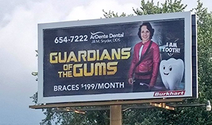
In Frankfort, Indiana, a dentist named Jill Snyder posted a billboard that was inspired by the Marvel movie Guardians of the Galaxy. Jill’s play on the title is called “Guardians of the Gums,” and she can be seen dressed as Star Lord, the main character of the movie. Instead of holding a laser gun in her hand, she has a toothbrush. There’s also a tooth with a word bubble over it saying “I am tooth,” which is a parody of the iconic character, Groot.
Other Creative Ideas
The next billboard doesn’t play into humor, but it serves as an example on how you can promote effectively. You’ve probably heard the saying, “All you have is your health.” I feel that this billboard here is a nice play on that. It’s essentially saying that your health—in this case, dental health—is far more valuable than material wealth like diamonds. The design is straightforward and uses a limited amount of words, but it all comes together nicely in a clever way.
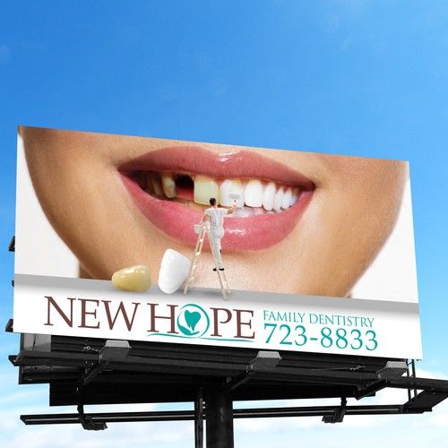
Another really creative example that I’ve seen is a design that shows a set of yellow teeth with a person on a ladder cleaning them. After searching around I found three billboards using this type of design, my favorite being this one. This design works so well because it meshes many elements together. It’s unconventional, kind of gross, and ultimately funny. This was a great way for the advertiser to use the medium to its advantage.
If you’re a dentist looking into reserving some ad space, you can start by creating a campaign on BillboardsIn. From there, we’ll help you find the perfect location that meets your criteria (and we can even help you make your artwork).

