Billboards for Healthcare Services
Billboards for healthcare services can actually play a vital role in day-to-day life. An essential part of promoting healthy lifestyles is to draw awareness to local resources that can help, and that’s exactly what these billboards do.
Promoting Healthcare in Communities
Healthcare services are foundational to the well-being in our daily lives. Overall, it’s fair to say that society as a whole is becoming far more health-conscious, and that’s because people are having more open conversations about different health conditions. From depression, addiction, and diseases, talking about health with others and seeking help is no longer taboo. Outside of major hospitals located in your local communities, people are opening their own practices. I’ve actually covered such businesses in the past, such as in this blog post.
After reviewing healthcare billboard examples online, I noted a couple of approaches that can be taken when choosing a design. You can use striking imagery, or play it straight. Let’s break down what this means.
Two Design Routes
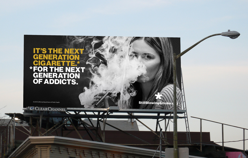
Striking imagery can immediately grab an audience’s attention. For example, StillBlowingSmoke.org released a billboard highlighting the future dangers of e-cigarettes. The design shows a young woman blowing a cloud of smoke, and with it being black and white, it’s very eye-catching.

At first, it seems as if they’re promoting e-cigarettes with the first sentence reading, “It’s the next generation cigarette,” but this is followed by, “For the next generation of addicts.” As you can see, the layout and color choice helps the viewer’s eyes travel across the billboard.
This design obviously wants to get a serious message across. It’s up to the advertiser to decide what approach they want to take, so if this isn’t the right fit, then consider this other design route.
Without the use of striking imagery, you can always take a more straightforward design approach using fonts and inviting colors. I often associate blue and white with the field of healthcare, and judging from most of the examples I saw, that seems to be the go-to color choice. As always, utilize bold sans-serif fonts that are easy to read. Cursive and/or handwritten fonts just don’t seem very appropriate when promoting healthcare.
In addition, include some attractive statistics that are relevant to your particular practice. For instance, if you’re rated number one in a certain area, or have won certain awards, it’s definitely including that somewhere.

