Hiring Billboards
Billboards are the perfect tool for recruiting new workers to your business.
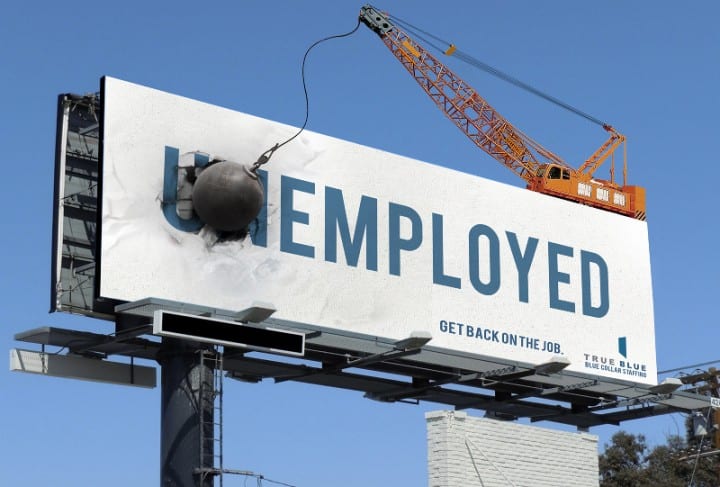
Hiring billboards should be big and bold in order to attract the attention of passersby. Take a look at the two examples below.
True Blue is a company that’s dedicated to connecting businesses with pools of workers. Their billboard design is unconventional and very creative, which means that their budget was very high.
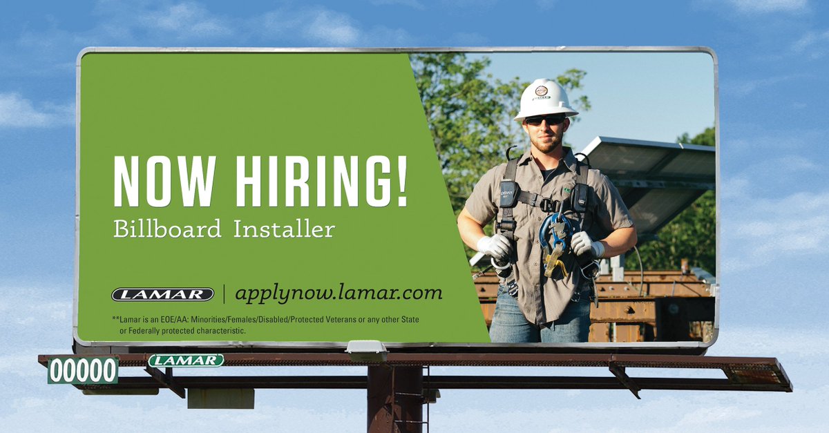
Not everyone has the finances to pull off such a billboard, but a traditional and cheaper design can be just as effective. Check out the example below from Lamar Advertising.


Lamar is a leading figure in OOH (out-of-home) advertising, so they have a great grasp on what makes an impactful billboard. Notice the bold lettering for “Now Hiring” and how large the font size is compared to the other words on the board. The main message of your billboard should always have this level of attention to it.
Touch upon the most essential information but don’t clutter your billboard with words. The above billboard has an image of the job position that is available (a billboard installer). That single image conveys a lot of information, and it makes the design interesting to look at, as opposed to just being a plain green background with text.
Using a QR code is an effective design method too, as described in our previous blog post here. A QR code could link to a hiring page with more detailed information. This could save a lot of room, and make the billboard more digestible to read.
For more fascinating explorations into the billboard industry, keep up to date with our blog.

