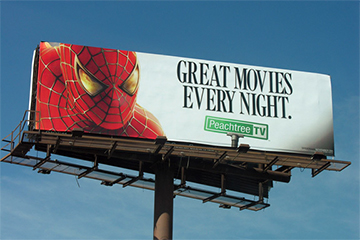
How to Design a Billboard
Designing the perfect billboard can seem daunting. Although billboards are seen by the masses, they are often only viewed for a couple of seconds. Billboard ads need to be bold, clear, and concise to capture the fleeting attentions of passersby. This post will outline the billboard design process, and attempt to arm readers with a variety of helpful tips that can be used to create designs that are sure to stand out.
When designing a billboard making sure to communicate only one concise message is incredibly important. Billboards are used for a wide variety of reasons so crafting a message that is clear and understandable will make the ad much more effective. Whether the purpose is to drive online traffic, or bring patrons into a local restaurant always remember to make the message simple, straightforward, and singular.
Designing a captivating visual can sometimes be the toughest part of billboard design. Not only do designs need to look great, they also need to catch people’s attention. Following these few tips will make any billboard design stand out, and help messaging cut through the clutter:
- Utilize primary colors. Make these the focal point of the billboard’s design and take advantage of the fact that bold colors such blue, yellow, and red naturally attract the human eye.
- A common rule of thumb is that if a company logo is to be included in the design it should be no smaller than ⅛ of the total image. Any smaller than that and it has the potential to be passed over and go unnoticed.
- 7 Words or Less. People passing by a billboard only have 3-5 seconds to interpret its meaning. Keep messaging short and sweet to make the maximum impact.
- Font choice should be bold, and preferably san-serif. Serif fonts can be ornate and interesting, but they can also cause confusion. It’s always better to keep it simple and make sure the message will be communicated.
- Using a play on words can be fun. They are memorable and have the potential to get people talking.
The final component of billboard design is reflection and evaluation. After creating a design that feels complete, step back and take an objective look. Does the design communicate everything it is supposed to? Can the design be easily read? If the answer to both of these questions is “yes” then the design is complete. Move forward confidently knowing that good design makes for an effective billboard.
Whether you have the perfect billboard design, or are starting from scratch check out BillboardIn’s comprehensive database and start planning your next outdoor ad campaign today!

